Advanced Typography (Task 1)
Advanced Typography (Task 1)
Dea Natasha Binti Mohd Khairul Fauzi (0368610)
Week 01 - Week 05 (22/04/2024 - 22/05/2024)
Bachelor of Design (Hons) in Creative Media
Task 1 (A) - Typographic Systems
Task 1 (B) - Type & Play
2 LECTURES
Week 1 (24/04/2024) : Typographic Systems
Update feedbacks on Google Sheets every week
Update your blog after every class
Download the 10 fonts provided if you haven't downloaded during last sem
Watch the lecture playlist
Read the MIB for more information about the first task.
For the first task; there are 3 headlines. Choose only one. Only use Adobe InDesign. Size of canvas is 200mm x 200mm. Do 8 sketches for 8 systems.
Work needs to be uploaded by next week.
There are 8 major variations of typographic systems which are:
- Axial
- Radial
- Dilatational
- Random
- Grid
- Modular
- Transitional
- Bilateral
 |
| Figure 2.11 Axial system |
1. Axial system : All elements are organized to the left or right of a single axis.
2. Radial system : All elements are extended from a point of focus.
3. Dilatational system : All elements expand from a central point in a circular fashion.
4. Random system : Elements appear to have no specific pattern or relationship.
5. Grid system : A system of vertical or horizontal divisions.
6. Transitional system : An informal system of layered banding.
7. Modular system : A series of non objective elements that are constructed in as a standardised units.
8. Bilateral system : All text is arranged symmetrically on a single axis.
 |
| Figure 2.12 Radial system |
2. Radial system : All elements are extended from a point of focus.
 |
| Figure 2.13 Dilatational system |
3. Dilatational system : All elements expand from a central point in a circular fashion.
 |
| Figure 2.14 Random system |
4. Random system : Elements appear to have no specific pattern or relationship.
 |
| Figure 2.15 Grid system |
5. Grid system : A system of vertical or horizontal divisions.
 |
| Figure 2.16 Transitional system |
6. Transitional system : An informal system of layered banding.
 |
| Figure 2.17 Modular system |
7. Modular system : A series of non objective elements that are constructed in as a standardised units.
 |
| Figure 2.18 Bilateral system |
8. Bilateral system : All text is arranged symmetrically on a single axis.
Week 2 (01/05/2024) : Typographic Composition
 |
| Figure 2.21 Principles of Design Composition |
1. Principles of Design Composition : Abstract notions such as emphasis, isolation and repetition seem ambiguous when it comes to translating it into typographic layout or compositions.
 |
| Figure 2.22 The Rule of Thirds |
2. The Rule of Thirds : A photographic guide to composition which basically suggests that a frame (space) can be divided into 3 columns and 3 rows. The intersecting lines are used as guide to place the points of interest within the given space.
 |
| Figure 2.23 How to use Grid System |
3. How to use Grid System : The versatility of the grid system and its modular nature tends to allow an infinite number adaptations. That's why it continues to remain popular.
4. Other models / systems :
- Environmental Grid
 |
| Figure 2.24 Environmental grid |
This system is based on the exploration of an existing structure or numerous structures combined. The systems/structures were developed around key features of an environment associated to the communicators of the message.
- Form and Movement
 |
| Figure 2.25 Form and Movement |
This system is based on the exploration of an existing Grid Systems. The placement of a form (irrespective of what it is) on a page over many pages creates movement.
Week 3 (08/05/2024) : Context and Creativity

The first letterforms created were designed to imitate handwriting. The shape and line of hand drawn letterforms were influenced by the tools and materials used to make them.

Cuneiform is the earliest system of actual writing which was used between 34 B.C.E. through the 1st century C.E. Hieroglyphics were created in 2613-2160 B.C.E. The ancient Egyptian writing system is a mixture of both rebus and phonetic characters.

Greece and Rome were elevated over much older and influential civilization. That's why the Greek influence on Rome is more talked about.

Middle Eastern alphabets was possibly influenced by the Egyptian Hieroglyphics and Heratic Scripts while the Chinese script evolved from the Oracle Bone to Seal Script to Clerical Script, for both traditional and simplified scripts.

The oldest writing systems present in Southeast Asia were Indian scripts. Pallava, a South Indian scripts, was originally used for writing Sanskrit and Tamil. Pallava became the basis for writing systems across Southeast Asia.

Jawi, the Arabic based alphabet, was introduced along with Islam. Islam encouraged the lower classes to learn writing for the sake of proselytization. The traders that were engaged in missionary work had taught Jawi to the people in the upper and middle class in the trading posts.

In modern Malaysia, Jawi is used for all our famous works of literature such as the hikayat and charm books. However, unlike Indonesia, we don't have a huge wealth of pre-Jawi inscriptions and writings. Some people claim that Jawi is "tulisan asal Melayu" which is untrue.

More vernacular scripts are being produced by Google as they begin to employ more Asian programmers and designers. These scripts are produced to cater to situations where the written matter is communicated in the vernacular script or vernacular and Latin scripts.


1. Research.
We should understand type history, type anatomy, type conventions, terminologies, side-bearing and many others when creating typeface.

Some sketches are done on paper and then scanned for the purpose of digitalisation. There are also sketches done digitally using digital tool sets such as Wacom.

FontLab and Glyphs App are some of the leading softwares used in the digitisation of typefaces.

Testing is an important part of the process of refining and correcting aspects of the typeface.

In Roman capital, the grid consists of a square and a circle inside it. Within the square, there is also a rectangle which is three quarters the size of the square. Grids can be used to facilitate the construction of a letterform.

Many different forms and constructions must be taken into account when designing a new type. A visual correction is also needed for the distance between letters.
Week 5 (22/05/2024) :
No class (Wesak Day).
3 TYPOGRAPHIC SYSTEMS
Week 1 (24/04/2024)
 |
| Figure 3.1 Watching the tutorial video |
 |
| Figure 3.2 Following the tutorial |
 |
| Figure 3.3 Final preview |
 |
| Figure 3.4 Final |
3.1 Axial System
 |
| Figure 3.11 Research |
 |
| Figure 3.12 Process |
3.2 Radial System
 |
| Figure 3.21 Research |
 |
| Figure 3.22 Process |
3.3 Dilatational System
 |
| Figure 3.31 Research |
 |
| Figure 3.32 Process |
3.4 Grid System
 |
| Figure 3.41 Process |
 |
| Figure 3.42 Research |
3.5 Random System
 |
| Figure 3.51 Research |
 |
| Figure 3.52 Process |
3.6 Transitional System
 |
| Figure 3.61 Research |
 |
| Figure 3.62 Process |
3.7 Modular System
 |
| Figure 3.71 Research |
 |
| Figure 3.72 Process |
3.8 Bilateral System
3.9 Final Submission
 |
| Figure 3.81 Research |
 |
| Figure 3.82 Process |
3.9 Final Submission
 |
| Figure 3.91 Axial system |
 |
| Figure 3.92 Radial system |
 |
| Figure 3.93 Dilatational system |
 |
| Figure 3.94 Grid system |
 |
| Figure 3.95 Random system |
| Figure 3.96 Transitional system |
 |
| Figure 3.97 Modular system |
 |
| Figure 3.98 Bilateral system |
https://drive.google.com/file/d/1I5epRP_xuBvXYWpSC9kifFjTJjPxq6tE/preview
4 TYPE & PLAY
4.1 Finding Type
Week 2 (01/05/2024)
For this task, we have to look for an image of a man-made object, structures or nature. Then, we must identify potential letterforms in the chosen image.
I started this task by searching for pictures related to nature. I found a picture of a seahorse that I feel is suitable for this task.
 |
| Figure 4.10 https://www.pinterest.com/pin/61783826132450222/ |
 |
| Figure 4.11 Extracting the letterforms |
 |
| Figure 4.12 Extracted letterforms |
 |
| Figure 4.13 Measuring the letterforms |
 |
| Figure 4.14 Final adjustments |
 |
| Figure 4.15 Final letterforms |
3.2 Finding Type Poster
Week 3 (08/05/2024)
Week 3 (08/05/2024)
 |
| Figure 4.20 Transferring the letters to the image |
 |
| Figure 4.21 Adding the text |
 |
| Figure 4.22 Removing background from the logos |
 |
| Figure 4.23 Finished poster |
 |
| Figure 4.24 Updated the design after consultation |
 |
| Figure 4.25 Final design |

5 REFLECTION
Experience :
The skills that I have gained when I learned Typography in Sem 1 has definitely helped me get through these tasks. While I do struggle a bit with the tasks, they are definitely a lot easier than the tasks that I did back in Sem 1.
Observation :
The letterforms for the same font must have a consistent style, or else they would look like different fonts. Besides the design, the colour choices for the fonts used in posters also play an important part to make the words stand out.
Finding :
This task has taught me how to get inspiration to create a new letterform from random stuff found in nature. I feel more confident for my future tasks.
6 FEEDBACK
Week 3 feedback
Specific : The letters don't look similar to each other. M and E look almost similar, but H and B are totally different.
General : The image is too complex and repetitive. There are small indifferences like the weight of the strokes.
Week 4 feedback
Specific : Too much happening in the bottom. The information is not really readable. Add an overlay above the image.
General : It is important to integrate the letterforms and image. Compare your work with other people's works to figure out how to fix your work.
7 FURTHER READING
For Task 1 (A), I read A Typographic Design: Form and Communication.


Page 99 is about the alignments of text in a page.

Page 101 shows examples of visual hierarchy using the same text but different arrangements and fonts, just like the task for exercise 1.
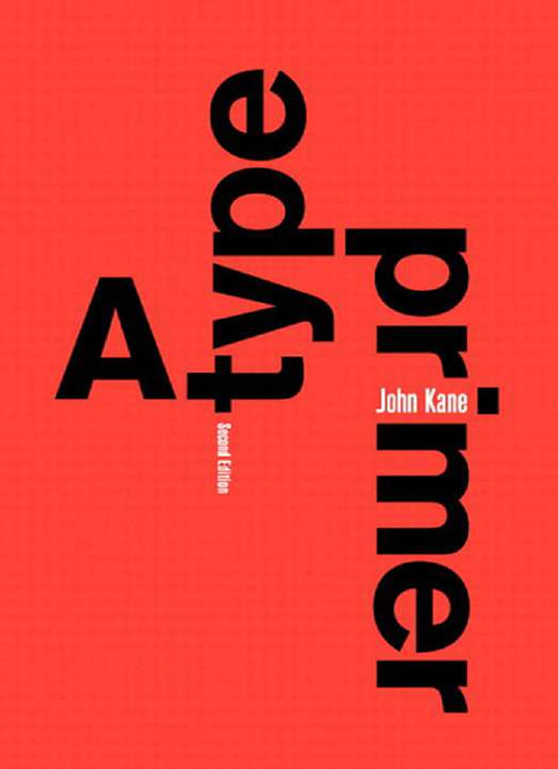
For Task 1 (B), I read A Type Primer 2nd Edition by John Kane.

Page 19 describes the typefaces. There's roman, italic, boldface, light, condensed and extended.

Page 25 is about display typefaces. The size of font is different according the the text's function such as the headlines and presentation.
.
.
.
THE END
.
.
.


Comments
Post a Comment