Interactive Design (Exercises)
INTERACTIVE DESIGN (Exercises)
23/04/2024 - 11/06/2024 (Week 01 - Week 08)
Dea Natasha Binti Mohd Khairul Fauzi (0368610)
Bachelor of Design (Hons) in Creative Media
Interactive Design
Exercises
2 LECTURE
Week 1 (23/04/2024) :
Download Netlify
We will be using Adobe CC
All individual assignments. No group assignments
Exercises:
a) Exercise 1 Web Analysis
Analyze an existing website and identify areas for improvements
b) Exercise 2 Replicate A Website
Replicate an existing website
c) Exercise 3 HTML and CSS Document Development
Do a recipe card
Assignment 1 :
We will be using Figma or Adobe XD
Design our own digital resume
This is just a prototype
Sketches (traditional, not digital), inspirations, prototypes, moodboard must be shown in e-portfolio
Assignment 2 :
Continuation of assignment 1
Finalize the digital resume
Assignment 3/Final Assignment :
Create a single page lifestyle microsite
Topic is "Anything that you love" (basically like a fanpage)
Has to be related to lifestyle
Have to propose the idea first
Week 2 (30/07/2024) :
This week, we learned about the layout design of websites. Click here to view the note for further reading.
Week 3 (07/05/2024) :
Websites normally are divided into three key elements which are header, body and footer.
Header : Top section of webpage. Provides quick access to essential information.
Body : Main area of a webpage. Contains text, images, videos and other multimedia elements.
Footer : Bottom of a webpage. Provides closure to the webpage and other navigation options.
Week 4 (14/05/2024) :
Nowadays, we don't have standard screen resolution. We mostly use mobile phones to browse websites.
There are many browsers that people can choose from such as Microsoft Internet Explorer, Mozilla Firefox, Google Chrome, Safari, Opera and others.
The World Wide Web Consortium (W3C) defines dozens of standards, including the standard markup languages that we use to build websites.
HTML describes the structure of pages. It is made up of characters that live inside angled brackets <> called HTML elements which are usually made up of two tags: an opening tag and a closing tag.
HTML provides us with two different lists which are ordered list (items is numbered) and unordered list (begins with a bullet point).
Links allow you to move from one browser to another and are created using the <a> element.
Week 5 (21/05/2024) :
Whenever you include an opening, must have a closing too - <table> ... </table> .
ID attribute is giving a unique name on the HTML text.
We can only use alphabet for the ID attribute.
If there are several HTML that have the same group, we can use class attribute.
Block element is created in a new line which is displayed from top to bottom. It is known as block level elements.
Inline elements will appear in the same line as their neighbouring elements.
Week 6 (28/05/2024) :
CSS rules contains two parts; a selector and a declaration.
CSS declaration sits inside curly brackets and each is made up of two parts; a property and a value. Different properties can be separated by a semi-colon.
We can use <link> to make sure all HTML documents have the same style.
Week 7 (04/06/2024) :
Padding and margin can be added individually for each element.
Id selector has the "#" symbol. Class selector has the "." symbol.
Descendant selector is used to select a specific descendant element.
Attribute selector is used to select an element with a specific attribute value.
Child selector is used to select elements that are direct children of another element.
Pseudo-class selector is used to select element based on their state and position.
Pseudo-element selector selects parts of an element.
Adjacent sibling selector selects an element that is immediately preceded by a specified element.
General sibling selector selects all elements that are siblings of a specified element.
Week 8 (11/06/2024) :
No class (ILW).
Week 9 (18/06/2024) :
<div> is a standard block-level element.
<span> is the standard inline element.
Other display properties are inline-block, flex, grid.
Each box has three layers surrounding its content which are padding, border and margin.
CSS flexbox is used to create responsive and efficient web layout.
A flexbox has parent and child element.
3 Exercise 1 : Web Analysis
In task 1, we were required to review two of the websites listed below. We have to take note on its design, layout, content and functionality. Then, we have to write a brief report in our e-portfolio.
Review 1
The Webby Awards website is a website about the winners of the 28th annual Webby Awards.
When you first enter the website, this is what you'll see. For me, my attention is first directed at the distracting background instead of its title.
When your scroll down a little bit, the "sign up to our newsletters" section pops up. The colour is nice and matches the background. However, there is simply too much info that we need to fill in if we want to sign up. It requires us to put in information about our company, job title and company URL. A viewer who has no company or job will not be able to sign up to this website's newsletters.
When you click the search button, it brings you to a new page. Having a drop down menu would be much easier and faster.
There also seems to be a glitch here. The video posted is right on top of the title and is very small. The video does work though, but the placement of it is very out of place.
When your cursor hovers over an article, the cursor turns into a big black circle with the word "drag" in the middle. It looks really weird.
Lastly, this big text at the end of the page is so unnecessarily huge. It even fills up the whole screen. Sure, it makes the point very clear but a smaller text would be good enough.
However, everything is arranged neatly such as the winner category. The list is placed on the side of the screen and the winners are arranged according to the categories.
However, after I opened the website on my phone, I noticed that the layout of the website becomes much nicer.
Review 2
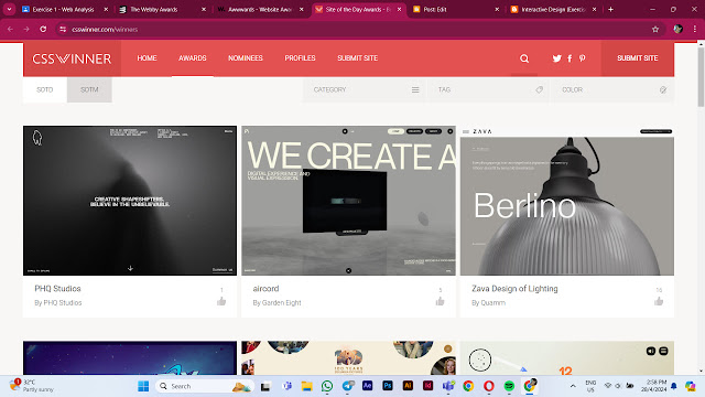
The CVS Winner website is a place where they showcase the best websites and promote innovative web designers, developers and agencies daily.
This is what the home screen looks like. I can't see any title on this page which makes me have a hard time to understand what the website is about.
Only after scrolling down to the bottom of the page did I manage to find out the purpose of this website.
I did like the fact that I did not have to scroll for a long time to reach the end of the page. Most of the pages have shortcut buttons located at the top of the home screen.
The list of the winners are arranged neatly. There is a picture for every winner which shows a glimpse of what their work is about.
When your cursor hovers above an article that you can click, the image turns dark and the date of the website nominated as the site of the day (SOTD). Every picture has a different date as this website nominates a different site every day.
After clicking an image, it brings you to a new page which shows information about the SOTD. We can see ratings of the site on the side of the image as well as short note about the agency behind the site.
After scrolling down a bit, there are arrows on both sides of the screen. When you click the arrow, you will be directed to the previous or next SOTD.
Viewers are also able the submit the website and agency profile to be nominated as the SOTD for the price of $9 (USD).
I tried to open the website on my phone and didn't see too much difference. This website is clearly created to accommodate any sort of device used by the viewers.
Total words : 775 words
4 Exercise 2 : Web Replication
Our task is to replicate two existing websites given in the link below.
https://www.oceanhealthindex.org/?authuser=0
Final Exercise 3 Netlify Link
Website 1
 |
| Identifying the location of the images |
5 Tutorial Exercise
Final Netlify link
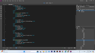
Create class schedule
Click here to check out the preview of my website.
Creating form
6 Exercise 3 : Create a Recipe Card
 |
| Writing the code |
 |
| Adding the images |
 |
| Adjusting the position of the images |
 |
| Writing the cooking instructions |
 |
| Adding the pictures for each steps |
 |
| Adding a table for extra information |
 |
| Adding the form |
 |
| Editing the table |
 |
| Changing the background |
 |
| Editing the ingredients |
 |
| Uploading to Netlify |
Final Exercise 3 Netlify Link
.
.
.
THE END
.
.
.


Comments
Post a Comment