Advanced Typography (Task 2)
ADVANCED TYPOGRAPHY (Task 2)
Dea Natasha Binti Mohd Khairul Fauzi (0368610)
Week 04 - Week 07 (15/05/2024 - 12/06/2024)
Bachelor of Design (Hons) in Creative Media
Task 2 (A) - Key Artwork


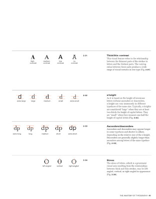
It is important to create contrast to create distinction between different information.

The first contrast is size. If you want to create a headline, you can differentiate the text and the headline by making the headline big.

The second contrast is weight. Weight describes how bold type can stand out against the lighter type of the same style.

Next contrast is form. It shows the distinction between a capital letter and its lowercase equivalent, or a roman letter and its italic variant.

Other than that, we have texture which refers to the way the lines of type look from a short or long distance.

There is also contrast in colour. The usage of colour is important to show which element needs to be emphasized. We have to pay attention to the tonal values of the colour that are used.

Form refers to the overall look and feel of the elements that make up the typographic composition. Typography can be seen as having two functions:
The first organisation is known as Gestalt which means the way a thing has been placed or put together. The Gestalt Theory emphasizes that the whole of anything is greater than its parts.

The law of similarity is the Gestalt law which states that elements that are similar to each other tend to be perceived as a unified group.

The law of closure means the mind's tendency to see complete figures or forms even if a picture is incomplete.

3 TASK 2 (A) KEY ARTWORK
Week 4 (15/05/2024)
Key artwork is a wordmark. We will create a wordmark that can be used as an artwork. The expansion of a wordmark is important. We have to explore and compose letters based on our name, nickname or any name that we want. The name must be able to be pronounced. We are basically have to create a brand of ourselves. The design must not be complicated. It should be easy to understand and readable.
Start with a mindmap. Put our name in the middle, and then list down everything about us. Can refer to the example in the blogs provided by Mr. Vinod. Come up with a typographic, visual and colour moodboard. After developing a word that represents ourself, start sketching a lot of ideas. When developing the form, do not think about the colour. Design it in black and white first. After the design is finalized, come up with a colour palette which has dark shade, neutral shade, light shade.
Choose a collateral which represents us. Don't choose random stuff.
Lastly, plan out an Instagram page with at least 9 grids. Take a picture of ourself and use it in the Instagram feed. Create a short animation, kind of like a GIF. Add the logo in some products that relate to us. We can use responsive logo.
First digitalised sketches

Week 5 (22/5/2024)
After a consultation session with Mr Vinod, I made a whole new batch of sketches based on the feedbacks given by him.
Final digitalised sketches
.jpg)
Images
Mr Vinod gave me some feedbacks during this week's consultation, so I did some minor changes on my design.


5 REFLECTION
Experience :
I like this task because it allows me to express myself through the design of my key artwork.
Observation :
After looking at my classmates' works, I got to see how they all see themselves when they design key artworks that they can relate to.
Finding :
This task has taught me to learn more about myself in order to express myself through a key artwork.
6 FEEDBACK
Week 5 feedback
Specific : Add one more letter. The exploration is very limited. The third option looks strong, but should explore more.
General : There shouldn't be any negative traits. Come up with a design that is meaningful.
Week 6 feedback
Specific : The tip of the "A" should be in the middle to provide stability. The head of the lion and "D" should be smaller.
General : There needs to be more individuality.
Dea Natasha Binti Mohd Khairul Fauzi (0368610)
Week 04 - Week 07 (15/05/2024 - 12/06/2024)
Bachelor of Design (Hons) in Creative Media
Task 2 (A) - Key Artwork
Task 2 (B) - Collateral
Week 4 (15/05/2024) : Designing Type

Adrian Frutiger created the typeface Frutiger which is a sans serif typeface. It was created to create a clean, distinctive and legible typeface that is easy to see.

Matthew Carter's fonts were created to address specific technical challenges. The font was tuned to be extremely legible even at very small sizes on the screen.

AT&T commissioned a font that could be used in their phone directories. The design solved multiple visual and technical problems related with the existing phonebook typeface.
Here are four general process of type design:
1. Research.
We should understand type history, type anatomy, type conventions, terminologies, side-bearing and many others when creating typeface.

2. Sketching
Some sketches are done on paper and then scanned for the purpose of digitalisation. There are also sketches done digitally using digital tool sets such as Wacom.

3. Digitisation
FontLab and Glyphs App are some of the leading softwares used in the digitisation of typefaces.

4. Testing
Testing is an important part of the process of refining and correcting aspects of the typeface.

Typeface construction:
In Roman capital, the grid consists of a square and a circle inside it. Within the square, there is also a rectangle which is three quarters the size of the square. Grids can be used to facilitate the construction of a letterform.

Construction and considerations:
Many different forms and constructions must be taken into account when designing a new type. A visual correction is also needed for the distance between letters.
Week 5 (22/05/2024) :


Here are four general process of type design:
1. Research.
We should understand type history, type anatomy, type conventions, terminologies, side-bearing and many others when creating typeface.

Some sketches are done on paper and then scanned for the purpose of digitalisation. There are also sketches done digitally using digital tool sets such as Wacom.

FontLab and Glyphs App are some of the leading softwares used in the digitisation of typefaces.

Testing is an important part of the process of refining and correcting aspects of the typeface.

In Roman capital, the grid consists of a square and a circle inside it. Within the square, there is also a rectangle which is three quarters the size of the square. Grids can be used to facilitate the construction of a letterform.

Many different forms and constructions must be taken into account when designing a new type. A visual correction is also needed for the distance between letters.
Week 5 (22/05/2024) :
No class (Wesak Day).

Perception in typography deals with the visual navigation and interpretation of the reader via contrast, form and organisation.


The first contrast is size. If you want to create a headline, you can differentiate the text and the headline by making the headline big.

The second contrast is weight. Weight describes how bold type can stand out against the lighter type of the same style.

Next contrast is form. It shows the distinction between a capital letter and its lowercase equivalent, or a roman letter and its italic variant.

Other than that, we have texture which refers to the way the lines of type look from a short or long distance.

There is also contrast in colour. The usage of colour is important to show which element needs to be emphasized. We have to pay attention to the tonal values of the colour that are used.

Form refers to the overall look and feel of the elements that make up the typographic composition. Typography can be seen as having two functions:
- To represent a concept
- To do so in a visual form

The first organisation is known as Gestalt which means the way a thing has been placed or put together. The Gestalt Theory emphasizes that the whole of anything is greater than its parts.

The law of similarity is the Gestalt law which states that elements that are similar to each other tend to be perceived as a unified group.
The law of proximity is the Gestalt law which states that the elements that are close together tend to be perceived as a unified group.

The law of closure means the mind's tendency to see complete figures or forms even if a picture is incomplete.
The law of (good) continuation means humans tend to perceive each of two or more objects as different, singular and uninterrupted object even when they intersect.

3 TASK 2 (A) KEY ARTWORK
Week 4 (15/05/2024)
Key artwork is a wordmark. We will create a wordmark that can be used as an artwork. The expansion of a wordmark is important. We have to explore and compose letters based on our name, nickname or any name that we want. The name must be able to be pronounced. We are basically have to create a brand of ourselves. The design must not be complicated. It should be easy to understand and readable.
Start with a mindmap. Put our name in the middle, and then list down everything about us. Can refer to the example in the blogs provided by Mr. Vinod. Come up with a typographic, visual and colour moodboard. After developing a word that represents ourself, start sketching a lot of ideas. When developing the form, do not think about the colour. Design it in black and white first. After the design is finalized, come up with a colour palette which has dark shade, neutral shade, light shade.
Choose a collateral which represents us. Don't choose random stuff.
Lastly, plan out an Instagram page with at least 9 grids. Take a picture of ourself and use it in the Instagram feed. Create a short animation, kind of like a GIF. Add the logo in some products that relate to us. We can use responsive logo.
 |
| Figure 3.10 Sketches |
 |
| Figure 3.11 Importing the sketches to Adobe Illustrator |
 |
| Figure 3.12 Digitalising the sketches |
First digitalised sketches

After a consultation session with Mr Vinod, I made a whole new batch of sketches based on the feedbacks given by him.
 |
| Figure 3.13 Sketches |
 |
Figure 3.14 Digitalising the sketches |
.jpg)
Week 6 (29/05/2024)
Mr Vinod gave me some feedbacks during this week's consultation, so I did some minor changes on my design.
 |
| Figure 3.15 Made the image look more balanced |
Final key artwork submission
Final wordmark animation submission
4 TASK 2 (B) COLLATERAL
I am a young female adult who likes aesthetic stuff. Nowadays, there are a lot of trending aesthetic products sold everywhere. I chose tote bag, phone case and a cap as my collaterals.
Three collaterals
After a consultation session with Mr. Vinod, I did some improvements.

New identity expansion
Final identity expansion
 |
| Figure 3.16 B&W |
 |
| Figure 3.17 Inverted B&W |
 |
| Figure 3.18 Colour pallette |
 |
| Figure 3.19 Actual colour against lightest colour |
 |
| Figure 3.19 Lightest colour against darkest colour |
https://drive.google.com/file/d/1g627snJpSAjeKAfY3-7RbM-oWu5ySVIJ/preview
Wordmark animation
Week 6 (29/05/2024)
 |
| Figure 3.20 Editing the wordmark GIF |
 |
| Figure 3.21 Changing the position, scale and rotation of the object |
 |
| Figure 3.22 Finalising the GIF |
 |
| Figure 3.23 Encoding the final GIF |

4 TASK 2 (B) COLLATERAL
a) Collateral
I am a young female adult who likes aesthetic stuff. Nowadays, there are a lot of trending aesthetic products sold everywhere. I chose tote bag, phone case and a cap as my collaterals.
 |
| Figure 4.10 Editing the key artwork for my collaterals |
Three collaterals
 |
| Figure 4.11 Collateral 1 |
 |
| Figure 4.12 Collateral 2 |
 |
| Figure 4.13 Collateral 3 |
Final collaterals
After a consultation session with Mr. Vinod, I did some improvements.
 |
| Figure 4.14 Collateral 1 |
 |
| Figure 4.15 Collateral 2 |
 |
| Figure 4.16 Collateral 3 |
b) Identity Expansion

 |
| Figure 4.17 Fixing the mistakes |
 |
| Figure 4.18 Editing the selfie |
 |
| Figure 4.19 Final identity expansion |
Final identity expansion

https://drive.google.com/file/d/1CFmzo1CE2_SQQeoQ9adLhW5opS7NSp3g/preview
Final Instagram screen grab
Click here to view my Instagram page.

5 REFLECTION
Experience :
I like this task because it allows me to express myself through the design of my key artwork.
Observation :
After looking at my classmates' works, I got to see how they all see themselves when they design key artworks that they can relate to.
Finding :
This task has taught me to learn more about myself in order to express myself through a key artwork.
6 FEEDBACK
Week 5 feedback
Specific : Add one more letter. The exploration is very limited. The third option looks strong, but should explore more.
General : There shouldn't be any negative traits. Come up with a design that is meaningful.
Week 6 feedback
Specific : The tip of the "A" should be in the middle to provide stability. The head of the lion and "D" should be smaller.
General : There needs to be more individuality.
Week 7 feedback
Specific: Revise the colour scheme. The pattern on the cap doesn't have any contrast. Use a plain background for the phone case.
General: Repeating your key artwork doesn't expand your identity.
7 FURTHER READING
For this task, I read A Typographic Design: Form and Communication.


7 FURTHER READING
For this task, I read A Typographic Design: Form and Communication.


.
.
.
THE END
.
.
.


Comments
Post a Comment